
[1]:
%matplotlib inline
NCL_taylor_6.py
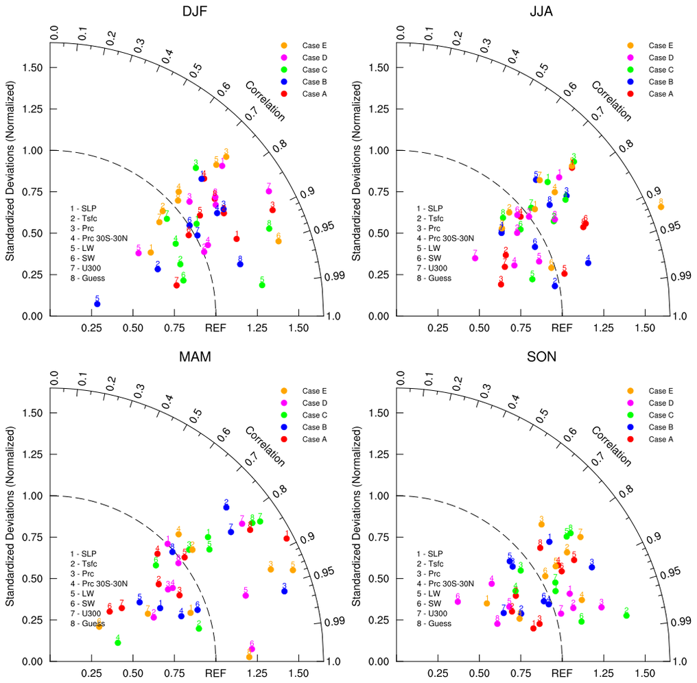
This script illustrates the following concepts: - Using geocat-viz Taylor diagram function to create a Taylor diagram. - Labelling a Taylor diagram - Using subplots
See following URLs to see the reproduced NCL plot & script: - Original NCL script - Original NCL plots
Note: Due to limitations of matplotlib’s axisartist toolkit, we cannot include minor tick marks between 0.9 and 0.99, as seen in the original NCL plot.
Import packages:
[2]:
import matplotlib.pyplot as plt
import numpy as np

import geocat.viz as gv
Plot:
[3]:
# Create figure
fig = plt.figure(figsize=(12, 12))
fig.subplots_adjust(wspace=0.3, hspace=0.3)

# Create a list of model names
namearr = ["SLP", "Tsfc", "Prc", "Prc 30S-30N", "LW", "SW", "U300", "Guess"]
nModel = len(namearr)

# Create a list of case names
casearr = ["Case A", "Case B", "Case C", "Case D", "Case E"]
nCase = len(casearr)

# Create lists of colors, labels, and main titles
colors = ["red", "blue", "green", "magenta", "orange"]
labels = ["Case A", "Case B", "Case C", "Case D", "Case E"]
maintitles = ["DJF", "JJA", "MAM", "SON"]

# Generate one plot for each season
for i in range(4):
    # Create dummy data for the season
    stddev = np.random.normal(1, 0.25, (nCase, nModel))
    corrcoef = np.random.uniform(0.7, 1, (nCase, nModel))

    # Create taylor diagram
    da = gv.TaylorDiagram(fig=fig, rect=221 + i, label='REF')

    # Add models case by case
    for j in range(stddev.shape[0]):
        da.add_model_set(stddev[j],
                         corrcoef[j],
                         xytext=(-4, 5),
                         fontsize=10,
                         color=colors[j],
                         label=labels[j],
                         marker='o')
    # Add legend
    da.add_legend(1.1, 1.05, fontsize=9, zorder=10)

    # Set fontsize and pad
    da.set_fontsizes_and_pad(11, 13, 2)

    # Add title
    da.add_title(maintitles[i], 14, 1.05)

    # Add model names
    da.add_model_name(namearr, x_loc=0.08, y_loc=0.4, fontsize=8)

# Show the plot
plt.show()
